My Sprint mobile app
Role: UX team manager
Team: 4 UX designers, 2 visual designers, 1 researcher
The old Sprint Zone app was at a crossroads. The Sprint brand was redefining itself and the old brand and name no longer fit, the technology powering the app was underpowered and customers were loudly voicing their displeasure. As the UX team manager I lead the effort partnering with research, product, business and tech to create a new framework and vision to define the future of the mobile application.
Problem
Customers struggled to find the information they needed to manage, pay and shop for their wireless plans on the old Sprint Zone mobile app, these lead to frustration, increased customer service calls and high wait times in the retail locations.
Approach
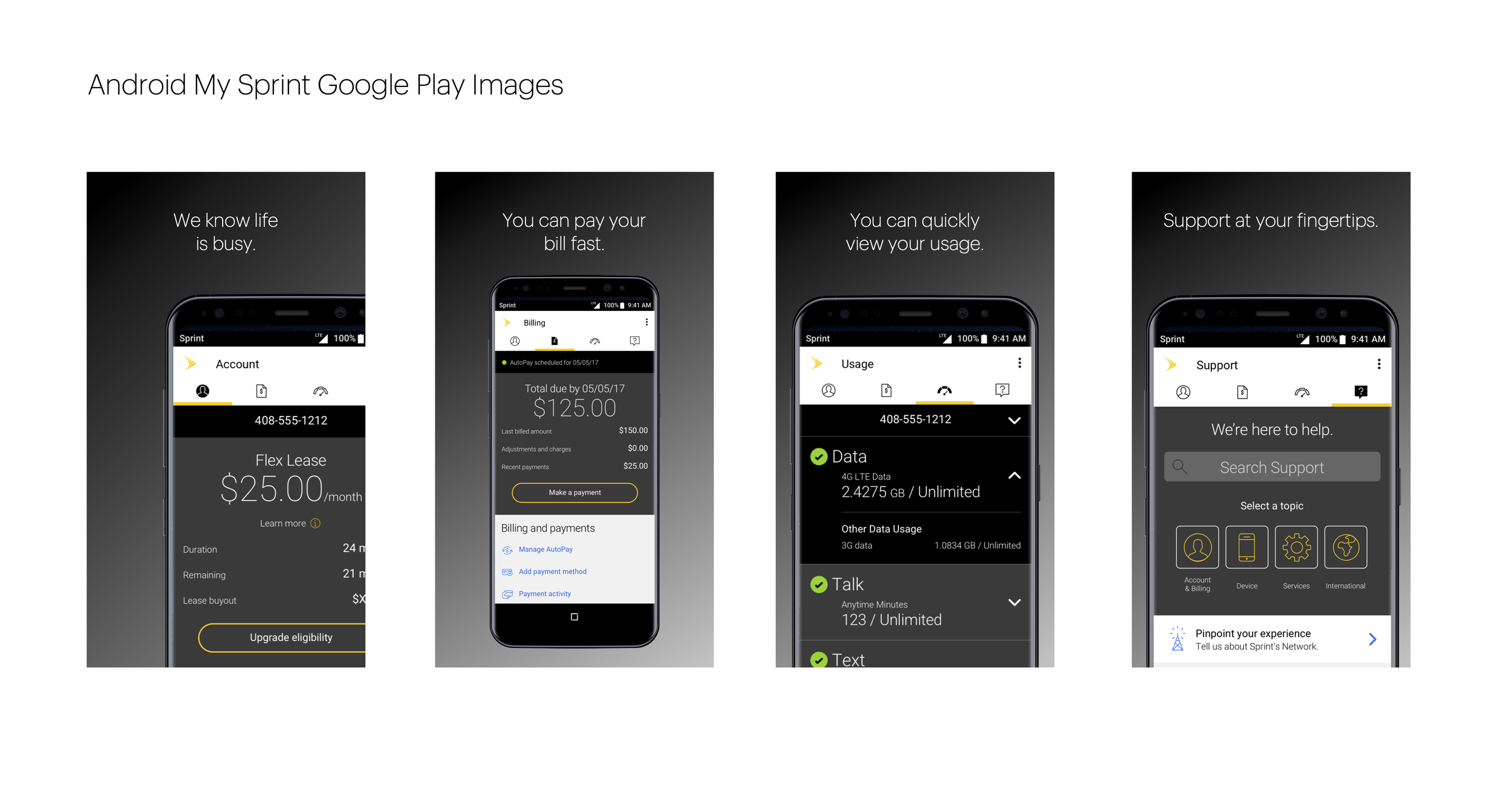
Using research and data the team identified core user tasks:
Pay a bill
Check data usage
Quick access to support articles and channels
Shopping for new devices
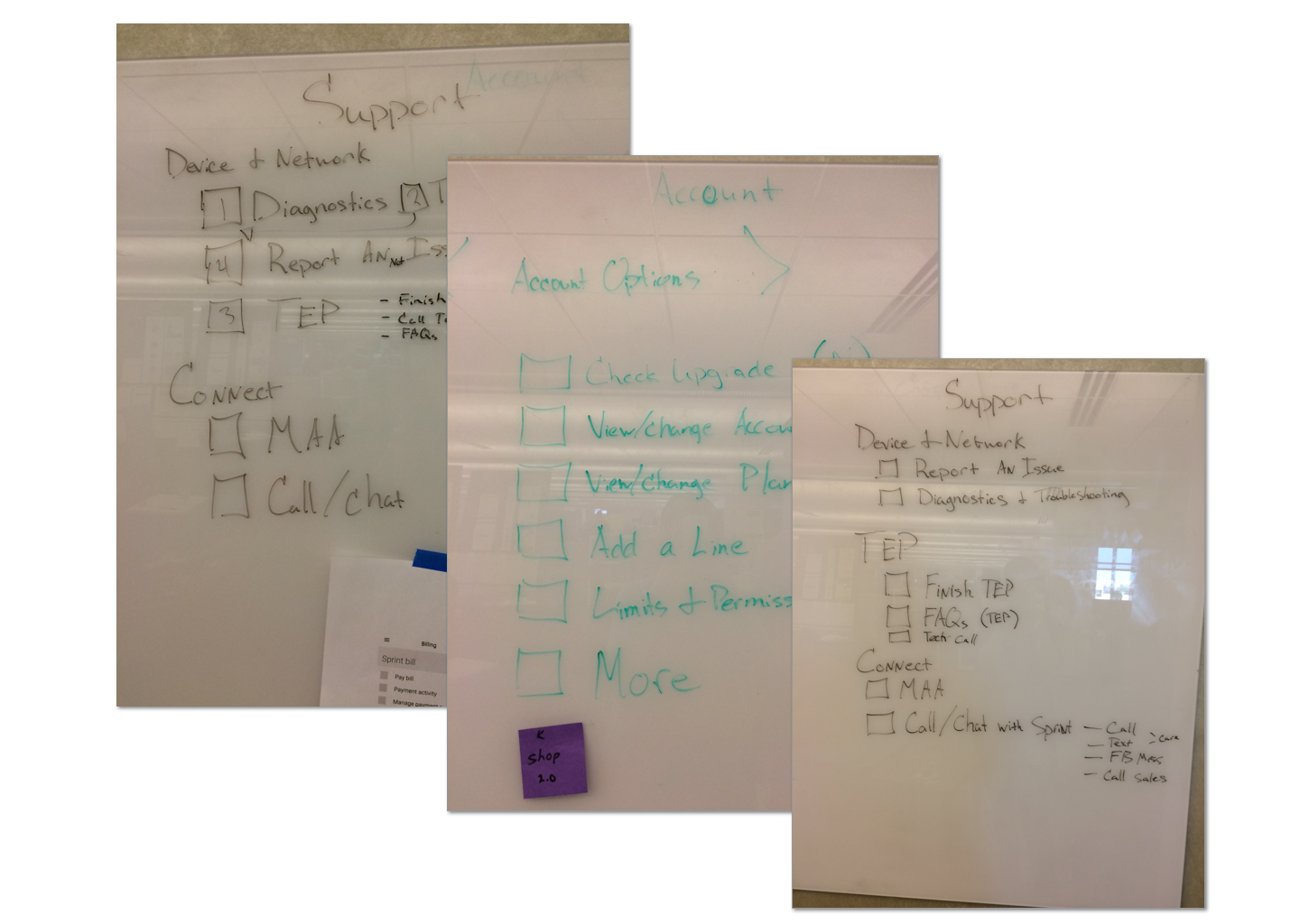
Many collaborative processes were used in addition to research to create the design, from white boarding ideation sessions to card sorts, the user-centered design process was used as a guide throughout the process. Taking these inputs the design team iterated on concepts to create a flexible, extensible framework for the app.
Feature design
Following the framework creation, individual features were iteratively designed. This involved close collaboration with product owners, system architects, and developers to ensure features not only fit the technology strategy but also addressed user needs identified through testing.
As the team created the new designs, I provided guidance and creative direction to ensure the laddered back into the overall strategy for the new My Sprint app.
Results
4+ star rating in Google Play and iOS App stores
Highest SUS usability scores in testing
Increased in scheduled retail appointments
Reduction in calls to customer care


